Field Notes // The Brand Review
What’s in a notebook?
I’m certainly not unique in my partiality to a good notebook. For many the act of notetaking isn’t merely a means to an end but an end in itself. A pleasant experience made all the more enjoyable by the thing you’re writing in.
Whole chains of stationery stores are built around a desire for notebooks ‘bound with affection’ and wrapped in gorgeous covers made from leather or funky recycled paper.
Popular brands of notebook, Moleskine and Leuchtturm 1917 attract people with their high-quality paper, varying sizes and satisfyingly simple but premium covers.
Field Notes make and distribute notebooks with a unique approach, regularly bringing out limited editions with a focus on different design and manufacture techniques.
What’s written inside a notebook is personal. What Field Notes have succeeded in recognising however is that the notebooks themselves are part of a shared experience.
Hey! I write blog content like this for brands in various sectors. Want something like this written for your brand? Get in touch.
You don’t get freebies like this everyday
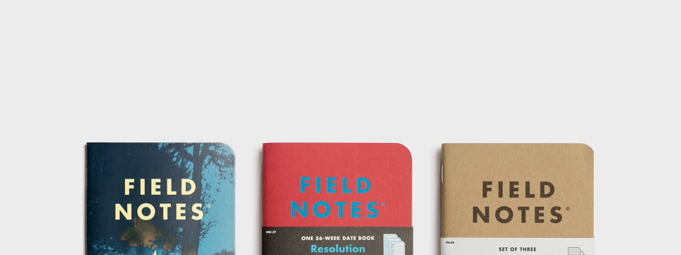
I first picked up a Field Notes notebook from a table of freebies at a coding and web development meetup. Sure, not exactly my natural habitat but freebies are always a win.
What particularly stuck out about these notebooks was how visually appealing they were. The feel of the cover material and the unique minimalist design immediately grabbed my attention and demanded that I pick one up. There was a variety of designs and styles to choose from.
Each notebook had a different theme and function. Some were checklists, some were lined journals, some were diaries and there were more besides. But despite this there was still a clear and refreshing simplicity to them all.
This might not appear to have anything to do with copy and everything to do with design, but my reasons for liking Field Notes are down to more than just a cool design. Digging deeper into the brand I realised that they have a cohesive ethos that runs through all their products.
The very same notebook mentioned above.
The beauty of a well-crafted grocery list
The copy at the back of the notebook summed up the brand perfectly. Who knows whether these words came before anything else but they definitely translated what had already been communicated through the physical product itself. It didn’t feel tacked on but rather reinforced what a solid brand it was.
“Inspired by the vanishing subgenre of agricultural memo books, ornate pocket ledgers, and the simple unassuming beauty of a well-crafted grocery list…” the blurb on the inside back cover reads. “the Draplin Design co…. brings you “FIELD NOTES” in the hopes of offering ‘an honest memo book worth fillin’ up with GOOD INFORMATION.”
This may seem a little esoteric to some, but that’s kind of the point. The guys behind Field Notes know exactly who they are marketing to…
People who appreciate the ‘unassuming beauty of a well-crafted grocery list’.
Only 4 emails a year!
Following the blurb is an extensive list of potential uses and precise specifications, all contributing to this idea of a notebook having value in and of itself and not simply being a means to an end.
This is of course true for any notebook. What sets Field Notes apart from Moleskine and other brands (as delightful as they are) is the collectability and community engagement of their brand.
Their offering is built around limited edition sets that are brought out throughout the year. Supporters can subscribe to a mailing list which releases a startlingly reserved 4 emails per year and lets them know about each newly released edition.
These naturally get swiped up. It’s this exclusivity and authenticity (I don’t know of many other brands that would dare send a meagre 4 emails out per year) that makes them so attractive to fans. They feel like they are buying off people just like them.
And as it happens, they are.
In an interview online, the creators of Field Notes notebooks reiterate the idea that writing notes is not a temporary thing in service of a more refined finished product, but rather an experience in and of itself. And it’s an experience they wanted to share with like-minded people.
With the notebook’s rugged and minimalist look, it’s no surprise that they started out being handmade. It started off as the side project of a couple of Chicago based designers but it is now the only thing they do. They originally sold to other designers and as such put a lot of effort into their online offering.
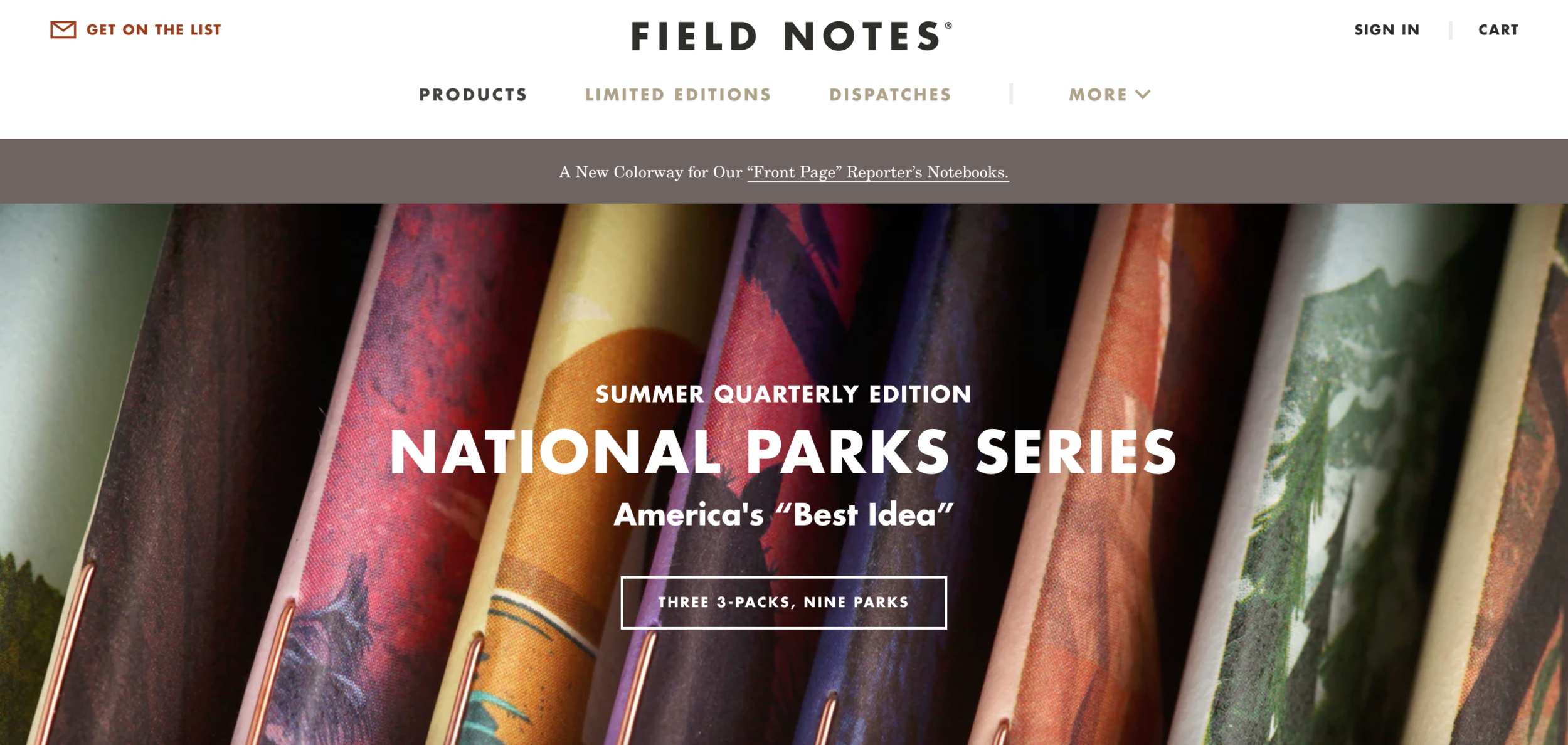
The Field Notes website is their storefront but it is not simply a cut and dry e-commerce site. The editorial aspect of it is front and centre. There’s a lot of copy here.
The products are surrounded by other pieces of branded stationery as well as editorial posts all about the new edition and the vision behind it. Often their notebooks involve different or unique printing techniques and materials and this is often explored in posts on the site.
The Field Notes website
Quality over quantity
Sure, conventional data would suggest they should amp up their marketing, send out more emails, offer more products etc. However, as they admit, they have resisted any changes that are not in keeping with their brand. They only worry about their own product and aim for quality over quantity.
The fact that you could probably guess all this - a love for the craft, a clear vision, integrity and a quality product above all else - simply from the product itself shows that the branding is clear and at the heart of what they do.
Increasingly, I think there is a desire for brands that aren’t afraid to be individual and aren’t obsessed with growth for the sake of growth. If you deliver a quality product that stands on its own and makes a decent number of people satisfied then you will have customers for life. What more could you want?
I will certainly continue to buy Field Notes notebooks for as long as I need notebooks. Which will probably be forever.
Did you enjoy this?
My fortnightly email newsletter has more nuggets of goodness from me plus a smattering of other good things I’ve happened across on the internet.


